An Introduction to the Color Wheel
Along with choosing the right light bulb, picking out paint colors for your home can be an agonizing experience for some. What usually comes to mind are the racks and racks of paint swatches at your local Home Depot accompanied by endless aisles of paint gallons on mile high industrial shelving. As you look at the millions of different colors distinguishable to the human eye, it can be hard to narrow down what color to use.
Secretly, this might be why most of us leave our walls safely in the neutral category. We prefer the safe zone and accent the space with accessories or furniture or paintings.
Most of us can identify the primary colors: Red, Yellow, and Blue. These three colors are the basis of everything. When you mix them two at a time you then get the secondary colors: Orange, Green, and Purple. The tertiary colors appear when you mix two secondary colors together and result in more complex appearances like red-orange and blue-green.
What most of us look to create is color harmony. Harmony, by definition, is something that is pleasing and goes together. Color harmony would therefore describe an environment with pleasing colors that go together in a way that is exciting and elicits a pleasurable response. With colors that don’t reach this goal, our eyes are either bored or overwhelmed. To accomplish harmony, there are some easy rules that we can follow when choosing our colors that utilize the color wheel.
Complementary Colors: Those colors located opposite each other on a color wheel.
Analogous Colors: Those colors located close together on a color wheel.
Monochromatic Colors: that are shade or tint variations of the same hue. (ie. light pink, pink, dark pink)
Split-Complementary Relationship Choose one color, find it’s opposite on the color wheel and then take the two colors directly next to it’s opposite.
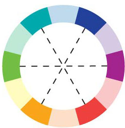
Double-Complementary Relationship Two complementary color sets; the distance between selected complementary pairs will effect the overall contrast of the final composition.
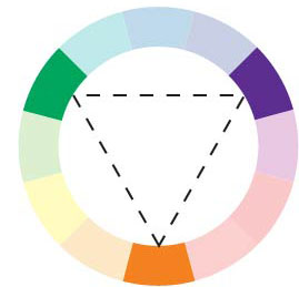
Triad Relationship Three hues equally positioned on a color wheel.
For the next few posts, we’re going to explore a little color theory and how the color wheel can help you pick paint colors that go with each other. For sake of explaining things, we are using very saturated, bold colors that are not very complex. If you can get the hang of these concepts with the bold bright colors, you can apply the same concepts to more complex colors (like the wall of 7 million colors at Home Depot, for example).
For today, let’s hammer out what primary, secondary, and tertiary colors look like.

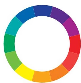
Basic 12-step color wheel

These are the primary colors on the wheel; primary colors are the basis for every color you see
Here are the secondary colors, or the colors that are made when you mix the primary colors together
Finally, the tertiary colors, which are the colors you get when you mix the secondary ones
For the next few posts, we’ll tackle how to find a color’s compliment, what analogous colors are, what monochromatic schemes look like, and even what the more complex color combinations are like split complimentary, double-complimentary, and triad relationships.