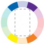
The Color Wheel Explained – Double Complimentary (Tetrad)

This double complimentary color scheme is echoed in Monet’s painting below.
Some refer to the double complimentary color scheme as very rich and busy. It uses four colors arranged into two complimentary color pairings. It is difficult to harmonize and balance correctly because if you use all four colors in equal amounts it can be overwhelming. Usually, one color is chosen to be dominant and the rest subdued.
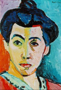
Matisse’s Green Stripe (Madame Matisse)
This arrangement is also sometimes called tetradic because it forms a tetrad in the color wheel formation. Tetrad literally means a group of four.
This weeks art examples are in the form of Monet and Matisse. You can see the warm orange and yellow tones clearly, while the cooler blue and violet recede.
Matisse’s use of color is a bit more straightforward but he uses his
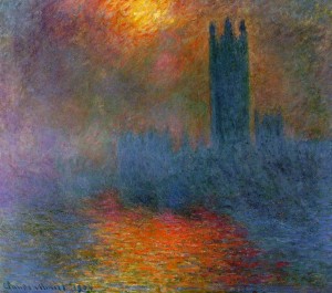
Monet’s double complimentary color scheme uses violet, yellow, orange, and blue
composition to balance out the colors as well with the violets and blues peeking out of the background and the oranges and yellows dominating the face of the portrait.
Double complimentary color schemes do have a lot of individual colors and can be hard to put together, but as you can see from these beautiful art masters, when done correctly they are mesmerizing in the way that they come together.