The Color Wheel Explained – Split Complimentary


A split-complimentary color scheme using the 12-step color wheel
Continuing in our color series, today we are tackling the split complimentary color scheme. If you need a refresher on what a complimentary color is, check out the last color blog which covered what complimentary colors look like. As a recap, to choose a color’s compliment you draw a line directly across the 12 step color wheel. Whatever color is opposite your chosen hue is that color’s compliment.
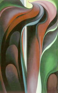
Georgia O’Keeffe’s Jack in the Pulpit No. V, featuring
Split complimentary colors take that idea one step further. To find a split complimentary color scheme, you follow the same progress. Select a color, and then find the color that is opposite the one that you chose. For example: if we were to choose yellow-orange, we would find it’s compliment directly across the wheel to be blue-violet. Next, we would look at the two colors directly adjacent to blue-violet on the color wheel, which in this case are violet, and blue (see illustration). Therefore, yellow-orange, blue, and violet form a triangle that is called a split complimentary relationship.

Frieseke’s Through the Vines featuring a split complimentary color scheme
Again, I’ve selected a couple of famous paintings to further illustrate this color relationship.
Georgia O’Keeffe uses red-violet paired off with yellows and greens in Jack in the Pulpit No. V to the right, while Frieseke’s Through the Vines shows a sharp orange-red contrasted with green and blue.